ShopDreamUp AI ArtDreamUp
Deviation Actions
![[GIFT] Art Fight #1](https://images-wixmp-ed30a86b8c4ca887773594c2.wixmp.com/f/fe8447ed-ab50-48f0-932c-893c34ea8472/dbi0t9g-7915057b-de3e-46da-8ea5-90ce72dad78e.png/v1/crop/w_92,h_92,x_0,y_8,scl_0.094650205761317,q_70,strp/_gift__art_fight___1_by_thespacephoenix_dbi0t9g-92s.jpg?token=eyJ0eXAiOiJKV1QiLCJhbGciOiJIUzI1NiJ9.eyJzdWIiOiJ1cm46YXBwOjdlMGQxODg5ODIyNjQzNzNhNWYwZDQxNWVhMGQyNmUwIiwiaXNzIjoidXJuOmFwcDo3ZTBkMTg4OTgyMjY0MzczYTVmMGQ0MTVlYTBkMjZlMCIsIm9iaiI6W1t7ImhlaWdodCI6Ijw9MTMwMCIsInBhdGgiOiJcL2ZcL2ZlODQ0N2VkLWFiNTAtNDhmMC05MzJjLTg5M2MzNGVhODQ3MlwvZGJpMHQ5Zy03OTE1MDU3Yi1kZTNlLTQ2ZGEtOGVhNS05MGNlNzJkYWQ3OGUucG5nIiwid2lkdGgiOiI8PTk3MiJ9XV0sImF1ZCI6WyJ1cm46c2VydmljZTppbWFnZS5vcGVyYXRpb25zIl19.psgnFX4LfjOy1JyO0SaZpfEfPBouDuYhLN2TH-d2pww)


![[GIFT] Sinamuna Pony - Day at the Beach](https://images-wixmp-ed30a86b8c4ca887773594c2.wixmp.com/f/fe8447ed-ab50-48f0-932c-893c34ea8472/dcs41ff-2f1c5be2-59d4-4438-a950-4376a52e8491.png/v1/crop/w_92,h_92,x_8,y_0,scl_0.044921875,q_70,strp/_gift__sinamuna_pony___day_at_the_beach_by_thespacephoenix_dcs41ff-92s.jpg?token=eyJ0eXAiOiJKV1QiLCJhbGciOiJIUzI1NiJ9.eyJzdWIiOiJ1cm46YXBwOjdlMGQxODg5ODIyNjQzNzNhNWYwZDQxNWVhMGQyNmUwIiwiaXNzIjoidXJuOmFwcDo3ZTBkMTg4OTgyMjY0MzczYTVmMGQ0MTVlYTBkMjZlMCIsIm9iaiI6W1t7ImhlaWdodCI6Ijw9OTYwIiwicGF0aCI6IlwvZlwvZmU4NDQ3ZWQtYWI1MC00OGYwLTkzMmMtODkzYzM0ZWE4NDcyXC9kY3M0MWZmLTJmMWM1YmUyLTU5ZDQtNDQzOC1hOTUwLTQzNzZhNTJlODQ5MS5wbmciLCJ3aWR0aCI6Ijw9MTI4MCJ9XV0sImF1ZCI6WyJ1cm46c2VydmljZTppbWFnZS5vcGVyYXRpb25zIl19.2EdAVSku4lR-arvoQxkdYsKZXhUu6OHWP1ceNXNnCTc)
![[FAN ART] - SSSS.Gridman Ponies](https://images-wixmp-ed30a86b8c4ca887773594c2.wixmp.com/f/fe8447ed-ab50-48f0-932c-893c34ea8472/dcrjdhn-f93269f1-289b-4ca0-a462-e72ffa69caaf.png/v1/crop/w_92,h_92,x_0,y_8,scl_0.059895833333333,q_70,strp/_fan_art____ssss_gridman_ponies_by_thespacephoenix_dcrjdhn-92s.jpg?token=eyJ0eXAiOiJKV1QiLCJhbGciOiJIUzI1NiJ9.eyJzdWIiOiJ1cm46YXBwOjdlMGQxODg5ODIyNjQzNzNhNWYwZDQxNWVhMGQyNmUwIiwiaXNzIjoidXJuOmFwcDo3ZTBkMTg4OTgyMjY0MzczYTVmMGQ0MTVlYTBkMjZlMCIsIm9iaiI6W1t7ImhlaWdodCI6Ijw9MTA2NyIsInBhdGgiOiJcL2ZcL2ZlODQ0N2VkLWFiNTAtNDhmMC05MzJjLTg5M2MzNGVhODQ3MlwvZGNyamRobi1mOTMyNjlmMS0yODliLTRjYTAtYTQ2Mi1lNzJmZmE2OWNhYWYucG5nIiwid2lkdGgiOiI8PTgwMCJ9XV0sImF1ZCI6WyJ1cm46c2VydmljZTppbWFnZS5vcGVyYXRpb25zIl19.pyBfKraJ9hXWJIIBAh8dM543wip83WkBv0-bjxrRuOU)


![Littlest Angel Pony Auction [CLOSED]](https://images-wixmp-ed30a86b8c4ca887773594c2.wixmp.com/f/fe8447ed-ab50-48f0-932c-893c34ea8472/dass9yz-f18dc58b-3fcd-48a2-afb2-f34e34fc7a6b.png/v1/crop/w_92,h_92,x_0,y_6,scl_0.028143163046803/littlest_angel_pony_auction__closed__by_thespacephoenix_dass9yz-92s.png?token=eyJ0eXAiOiJKV1QiLCJhbGciOiJIUzI1NiJ9.eyJzdWIiOiJ1cm46YXBwOjdlMGQxODg5ODIyNjQzNzNhNWYwZDQxNWVhMGQyNmUwIiwiaXNzIjoidXJuOmFwcDo3ZTBkMTg4OTgyMjY0MzczYTVmMGQ0MTVlYTBkMjZlMCIsIm9iaiI6W1t7ImhlaWdodCI6Ijw9MTEzNyIsInBhdGgiOiJcL2ZcL2ZlODQ0N2VkLWFiNTAtNDhmMC05MzJjLTg5M2MzNGVhODQ3MlwvZGFzczl5ei1mMThkYzU4Yi0zZmNkLTQ4YTItYWZiMi1mMzRlMzRmYzdhNmIucG5nIiwid2lkdGgiOiI8PTkwMCJ9XV0sImF1ZCI6WyJ1cm46c2VydmljZTppbWFnZS5vcGVyYXRpb25zIl19.suQe6RoCrTRY_SlsdpxuJ2mCYfjzDq5bUn0-Tpyio2Y)
Suggested Deviants


Suggested Collections


You Might Like…


![bORIng [COM]](https://images-wixmp-ed30a86b8c4ca887773594c2.wixmp.com/f/756a581f-88e2-4d6a-9d77-d67961804ad7/dccewa6-a69252f5-8786-4542-b437-9f1695bed266.png/v1/crop/w_184,h_184,x_5,y_0,scl_0.17037037037037,q_70,strp/boring__com__by_volgaisglitching_dccewa6-92s-2x.jpg?token=eyJ0eXAiOiJKV1QiLCJhbGciOiJIUzI1NiJ9.eyJzdWIiOiJ1cm46YXBwOjdlMGQxODg5ODIyNjQzNzNhNWYwZDQxNWVhMGQyNmUwIiwiaXNzIjoidXJuOmFwcDo3ZTBkMTg4OTgyMjY0MzczYTVmMGQ0MTVlYTBkMjZlMCIsIm9iaiI6W1t7ImhlaWdodCI6Ijw9OTI4IiwicGF0aCI6IlwvZlwvNzU2YTU4MWYtODhlMi00ZDZhLTlkNzctZDY3OTYxODA0YWQ3XC9kY2Nld2E2LWE2OTI1MmY1LTg3ODYtNDU0Mi1iNDM3LTlmMTY5NWJlZDI2Ni5wbmciLCJ3aWR0aCI6Ijw9MTAyNCJ9XV0sImF1ZCI6WyJ1cm46c2VydmljZTppbWFnZS5vcGVyYXRpb25zIl19.j4L419MoaGKdmhC_Fz8MIzM0T1vfXKV9fKeKe86iuEE)
![bORIng [COM]](https://images-wixmp-ed30a86b8c4ca887773594c2.wixmp.com/f/756a581f-88e2-4d6a-9d77-d67961804ad7/dccewa6-a69252f5-8786-4542-b437-9f1695bed266.png/v1/crop/w_92,h_92,x_2,y_0,scl_0.085185185185185,q_70,strp/boring__com__by_volgaisglitching_dccewa6-92s.jpg?token=eyJ0eXAiOiJKV1QiLCJhbGciOiJIUzI1NiJ9.eyJzdWIiOiJ1cm46YXBwOjdlMGQxODg5ODIyNjQzNzNhNWYwZDQxNWVhMGQyNmUwIiwiaXNzIjoidXJuOmFwcDo3ZTBkMTg4OTgyMjY0MzczYTVmMGQ0MTVlYTBkMjZlMCIsIm9iaiI6W1t7ImhlaWdodCI6Ijw9OTI4IiwicGF0aCI6IlwvZlwvNzU2YTU4MWYtODhlMi00ZDZhLTlkNzctZDY3OTYxODA0YWQ3XC9kY2Nld2E2LWE2OTI1MmY1LTg3ODYtNDU0Mi1iNDM3LTlmMTY5NWJlZDI2Ni5wbmciLCJ3aWR0aCI6Ijw9MTAyNCJ9XV0sImF1ZCI6WyJ1cm46c2VydmljZTppbWFnZS5vcGVyYXRpb25zIl19.j4L419MoaGKdmhC_Fz8MIzM0T1vfXKV9fKeKe86iuEE)
![grumpy boi [comm]](https://images-wixmp-ed30a86b8c4ca887773594c2.wixmp.com/f/a895a6d0-4328-4482-8013-ee53bb079070/ddjpf9x-b291a245-99c8-495a-a1c2-705a4b990117.png/v1/crop/w_184,h_184,x_0,y_15,scl_0.23958333333333,q_70,strp/grumpy_boi__comm__by_virus_wolf_ddjpf9x-92s-2x.jpg?token=eyJ0eXAiOiJKV1QiLCJhbGciOiJIUzI1NiJ9.eyJzdWIiOiJ1cm46YXBwOjdlMGQxODg5ODIyNjQzNzNhNWYwZDQxNWVhMGQyNmUwIiwiaXNzIjoidXJuOmFwcDo3ZTBkMTg4OTgyMjY0MzczYTVmMGQ0MTVlYTBkMjZlMCIsIm9iaiI6W1t7ImhlaWdodCI6Ijw9MTAyNCIsInBhdGgiOiJcL2ZcL2E4OTVhNmQwLTQzMjgtNDQ4Mi04MDEzLWVlNTNiYjA3OTA3MFwvZGRqcGY5eC1iMjkxYTI0NS05OWM4LTQ5NWEtYTFjMi03MDVhNGI5OTAxMTcucG5nIiwid2lkdGgiOiI8PTc2OCJ9XV0sImF1ZCI6WyJ1cm46c2VydmljZTppbWFnZS5vcGVyYXRpb25zIl19.oEzB33BgZ1CEK6InqtXWGe3W5QYKCMw65zi3yJgmrN0)
![grumpy boi [comm]](https://images-wixmp-ed30a86b8c4ca887773594c2.wixmp.com/f/a895a6d0-4328-4482-8013-ee53bb079070/ddjpf9x-b291a245-99c8-495a-a1c2-705a4b990117.png/v1/crop/w_92,h_92,x_0,y_8,scl_0.11979166666667,q_70,strp/grumpy_boi__comm__by_virus_wolf_ddjpf9x-92s.jpg?token=eyJ0eXAiOiJKV1QiLCJhbGciOiJIUzI1NiJ9.eyJzdWIiOiJ1cm46YXBwOjdlMGQxODg5ODIyNjQzNzNhNWYwZDQxNWVhMGQyNmUwIiwiaXNzIjoidXJuOmFwcDo3ZTBkMTg4OTgyMjY0MzczYTVmMGQ0MTVlYTBkMjZlMCIsIm9iaiI6W1t7ImhlaWdodCI6Ijw9MTAyNCIsInBhdGgiOiJcL2ZcL2E4OTVhNmQwLTQzMjgtNDQ4Mi04MDEzLWVlNTNiYjA3OTA3MFwvZGRqcGY5eC1iMjkxYTI0NS05OWM4LTQ5NWEtYTFjMi03MDVhNGI5OTAxMTcucG5nIiwid2lkdGgiOiI8PTc2OCJ9XV0sImF1ZCI6WyJ1cm46c2VydmljZTppbWFnZS5vcGVyYXRpb25zIl19.oEzB33BgZ1CEK6InqtXWGe3W5QYKCMw65zi3yJgmrN0)


Description
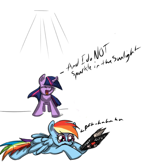
RAN OUT OF TIME AGAIN >.< RAAAAAGE
Seriously.. I should have been drawing this all day but I couldn't think of anything and then when I did, it was already 10 minutes passed the upload time, and I had to throw on shading like hell without thinking much about it (light source is above this time) and make it probably VERY innacurate as well as colored sloppily and nor finished.
I wanted to put Celestia (the sun) hugging a beaming Twilight Sparkle (equivalent to sparkling) to prove her wrong... And add and background and aggh. I'll fix it later.
NATG Day 3 complete (or as best I can do now) Pony with a Prop!
Image size
500x548px 101.45 KB
© 2012 - 2024 TheSpacePhoenix
Comments1
Join the community to add your comment. Already a deviant? Log In
I have the feeling the spirit of the competition is to practice and improve. In these events, if you can choose between spending extra time and missing the deadline, I'd honestly recommend missing the deadline. Take your time with these things; Rushing along will tend to bite you in the ass. Or, start sooner! Don't fear that paper.
As for the lighting, it's... actually not too bad if you consider the light from an in-front-and-from-above position, and I can't find any incredibly glaring flaws, but I just woke up, so. TS's legs and chest should probably have a bit less shadow, or maybe even more depending on the shadow her head may be casting. Also note that in general, it's a good idea to avoid light sources that are too close to the camera, or your lighting comes out looking kind of flat; One of the main purposes of shadows is to give an impression of the form that you otherwise wouldn't get from the shape of the object. If your lighting comes too close to the camera position, you miss out on a lot of that because the shadows will be minimal and very close to what your outlines are.
Here's another tip: Consider dropping a cast shadow on the ground below the pony. Even if it's a really simple and vague one, it'll give more of a sense of space, so it won't look quite so much like the ponies are floating in a void. It'll also force you to make a decision about where the light is depth-wise.
Also, you really need to work on your pony heads; They're a lot more stylized than I think you're intending. Really look at those pony heads and faces, the ones in the cartoon, and consider drawing them in isolation.
One last tip: When sketching out the pony forms, consider taking a moment to draw their "wireframes" or "meshes" or "cross countours" or whatever you want to call them. It'll give you a much better feel for what the forms of the pony are. You don't have to go into as much detail, but it might help expose problems earlier on, and help you in visualizing the ponies as 3D objects.